Top Parent Level Not Clickable & Not Link to Page on Divi Mobile Menu with Collapse Nested Items
When using Divi responsive theme for WordPress, Divi automatically presents mobile menu to visitors when the media screen width is less than 1025px. By default, all menu items, including sub-menu items, are displayed in full expanded view with all menu items on the list.
Elegant Themes, the developer of the Divi theme, provides a nifty trick to hack the mobile menu which collapses the nested menu items. With the JS and CSS snippet trick, only top parent level of the menu is visible, and visitors can choose to tap on a menu item or expand icon to maximize or minimize the nested sub-menu items.
But the collapsing of nest menu items bring a major drawback – the parent level menu item no longer linkable to its own web page. In other words, tapping on the parent menu item that has nested sub-menus only expand or collapse the sub-menus, even though the parent menu itself leads to a valid web page URL, essentially preventing visitors to access the web page. On the desktop (with normal menu), it will load and open the web page, while mouse hovers over the parent menu will reveal the nested sub-menus.
The behavior is by design, and is how mobile menu is intended to work when collapsible menu is enabled. If a menu item has sub-menu items, tapping on it will open or close the nested sub-menu items instead of follow the link. This is because there is no concept of hovering over the mouse on mobile devices and smartphones. Thus, the click is used as the fire event to expand or collapse the sub-menus. If the parent menu loads on click, the nested menu is not expanded.
There are two methods to workaround the limitations though, as details in tutorial below.
Method 1: Make Parent Menu of Nest Menu Items Clickable and Visitable
In order to change the behavior of the collapsible nested mobile menu so that it could load the parent page on click, we need to change the JavaScript provided by Elegant Themes. The following trick makes the left side of parent menu responds to click / tap to load its own page, while leaving the right side of the parent menu where the icon resides continue to work to open or close the nested menu
In WordPress Admin, go to Divi -> Theme Options -> Integration. In the Add code to the body text box, replace the code snippet for the collapsible mobile menu hack with the following:
Then go to Divi -> Theme Options -> General, and add the following code snippet in the Custom CSS text box:
#main-header .et_mobile_menu .always-visitable {
    position: relative;
}
#main-header .et_mobile_menu .always-visitable .hover-link {
    position: absolute;
    top: 0; left: 0; bottom: 0;
    right: 60px; /* right area continues to expand or collapse */
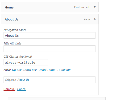
Lastly, go to Appearance -> Menus. Enable the CSS Classes entry for menu items, and then add the always-visitable into the text box of CSS Classes (optional) for each and every parent menus which has nested menu items, and which has its own web page that should be opened when clicked. The CSS class should be added not only to top level menus, but also second or third level sub-menus individually.
Method 2: Add a Sub-Menu Item with Link to Parent Menu Item
The trick below add a child menu item in the sub-menu with the link of the parent menu item, and then hide the child menu item on desktop only. The parent menu itself continues to only expand or collapse the nested child menus.
In WordPress Admin, go to Divi -> Theme Options -> General, and add the following code snippet in the Custom CSS text box:
@media only screen and (min-width: 1025px) {
    .hide-menu {
        display:none !important;
    }
}
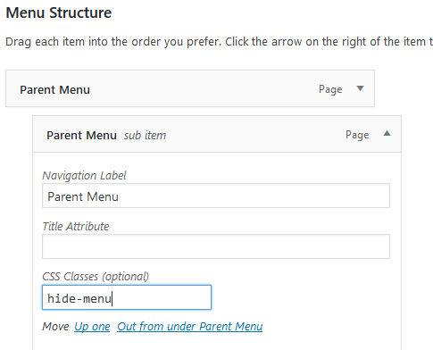
Then, go to Appearance -> Menus. Enable the CSS Classes entry for menu items. Add the parent menu item as its own nest sub-menu child item, and add this CSS class to its CSS Classes (optional) text field:
LK is a technology writer for Tech Journey with background of system and network administrator. He has be documenting his experiences in digital and technology world for over 15 years.Connect with LK through Tech Journey on Facebook, Twitter or Google+.

 to WordPress Navigation Menu")

")
 Handlers or Items with ShellExView")

 to Folders Context Menu in Windows")

")