At the moment, Microsoft is hard at work on the next version of Windows, which is commonly referred to as “Next Valley” internally. Microsoft was returning to a three-year development cycle for the next major version of Windows, with the next client release currently scheduled for some time in 2024.
Microsoft accidentally shared a screenshot of an unnamed Windows user interface at its Ignite 2022 conference, where it also unveiled its new Surface PC lineup. However, an image showcasing a variant of the company’s flagship OS that the users were still unaware of, has caught attention. Thus, the Redmond company might have shown a preview of the Windows 12 UI.
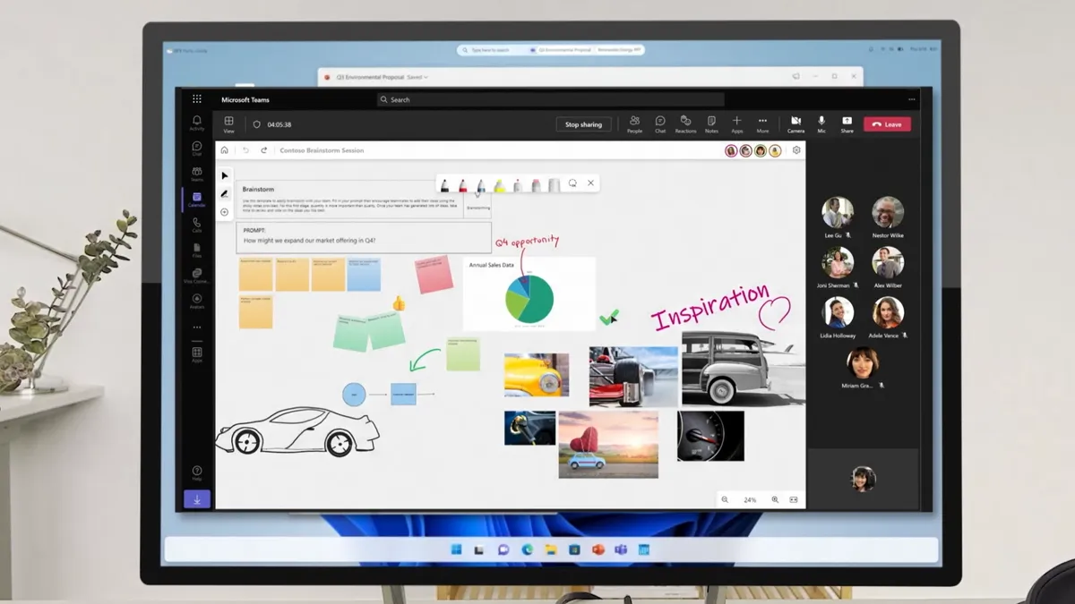
I didn’t expect to be writing about the next version of Windows again so soon, but a handful of viewers watching the Ignite Keynote yesterday noticed an updated version of the Windows UI. The site investigated this image, which was used to illustrate Microsoft Teams during the presentation (after it was said that Windows 12 could arrive in 2024).
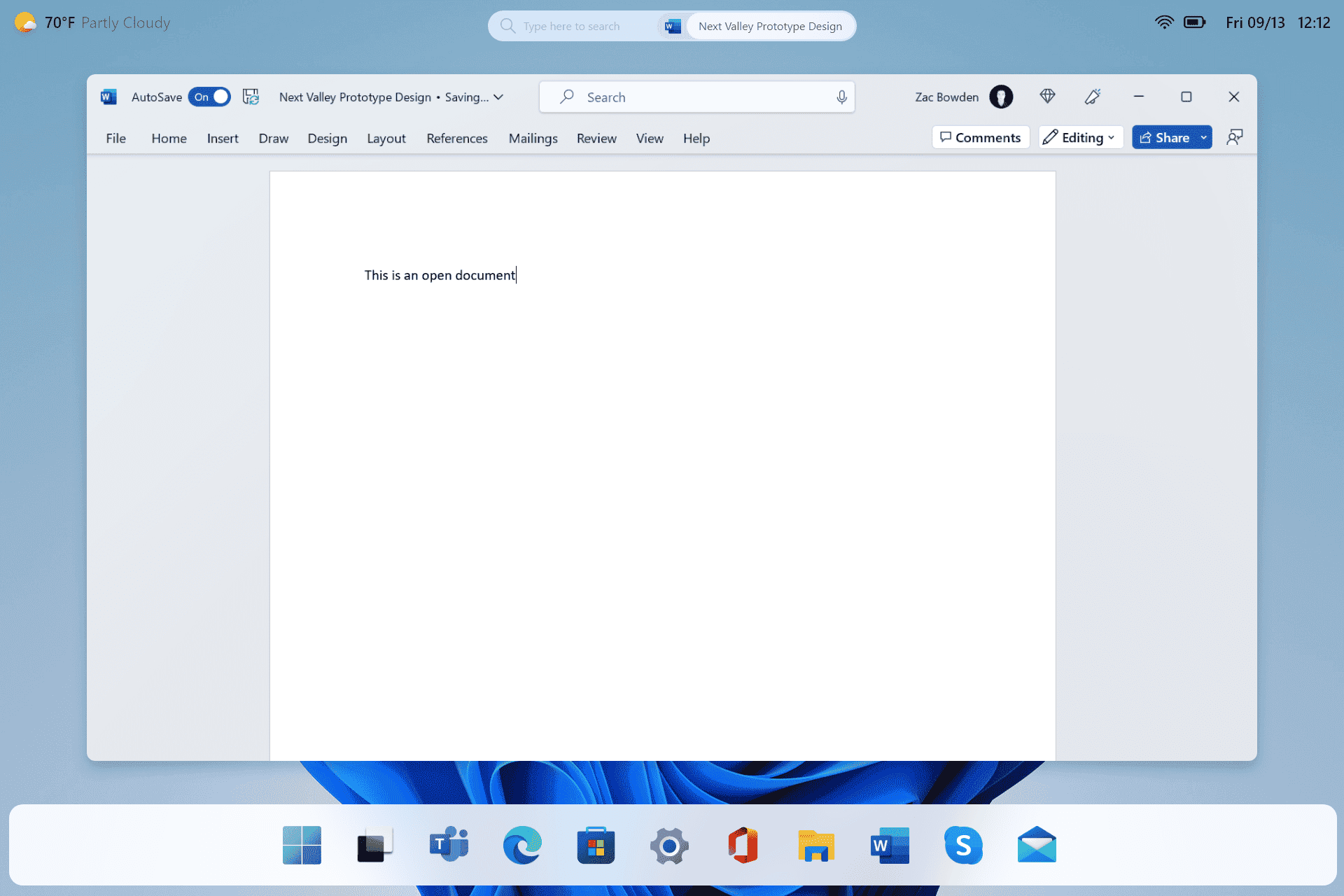
The illustration shows the new user interface. It has seen different variations of this design layout and does not look like the Windows interface we are used to. That was shown in a brief cutaway, including a version that houses the system icons/elements along the top in a translucent bar instead of just floating on the desktop, a floating search box in the top middle, and the weather appears in the top left.
Due to the low quality of the image, a model was created by Windows Central that accurately demonstrates what was seen as a better idea of what it’s supposed to look like. As they have already seen an internal presentation of a similar Windows 12 interface prototype with a similar layout.
Although it is still unclear how such an image ended up in the middle of a Microsoft conference. Most likely, this is not the most recent build of Windows 12. This example, at least, gives a general idea of the interface and shows the potential direction in which Microsoft’s operating system can develop and serve as a statement of what the Microsoft team hopes to achieve with the upcoming release (codenamed NextValley).
Last but not least, Microsoft has struggled to find a balance between touch and mouse users with previous versions of Windows. Windows 8 was too touch-centric, and Windows 10 was too mouse-centric. Windows 11 attempts to find a balance, but it still leans more toward mouse input first and touches input second.
